Ace Dice Package Redesign
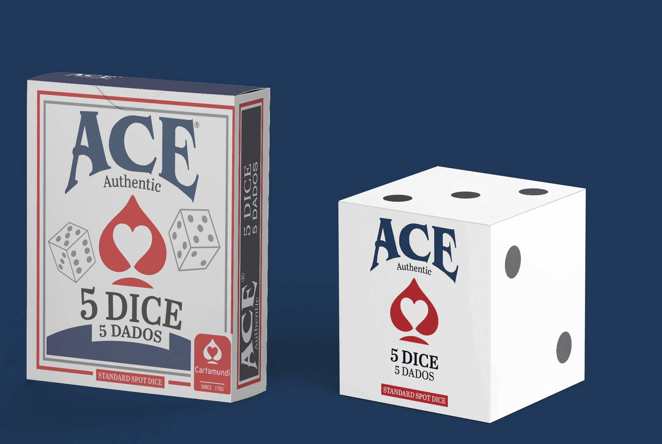
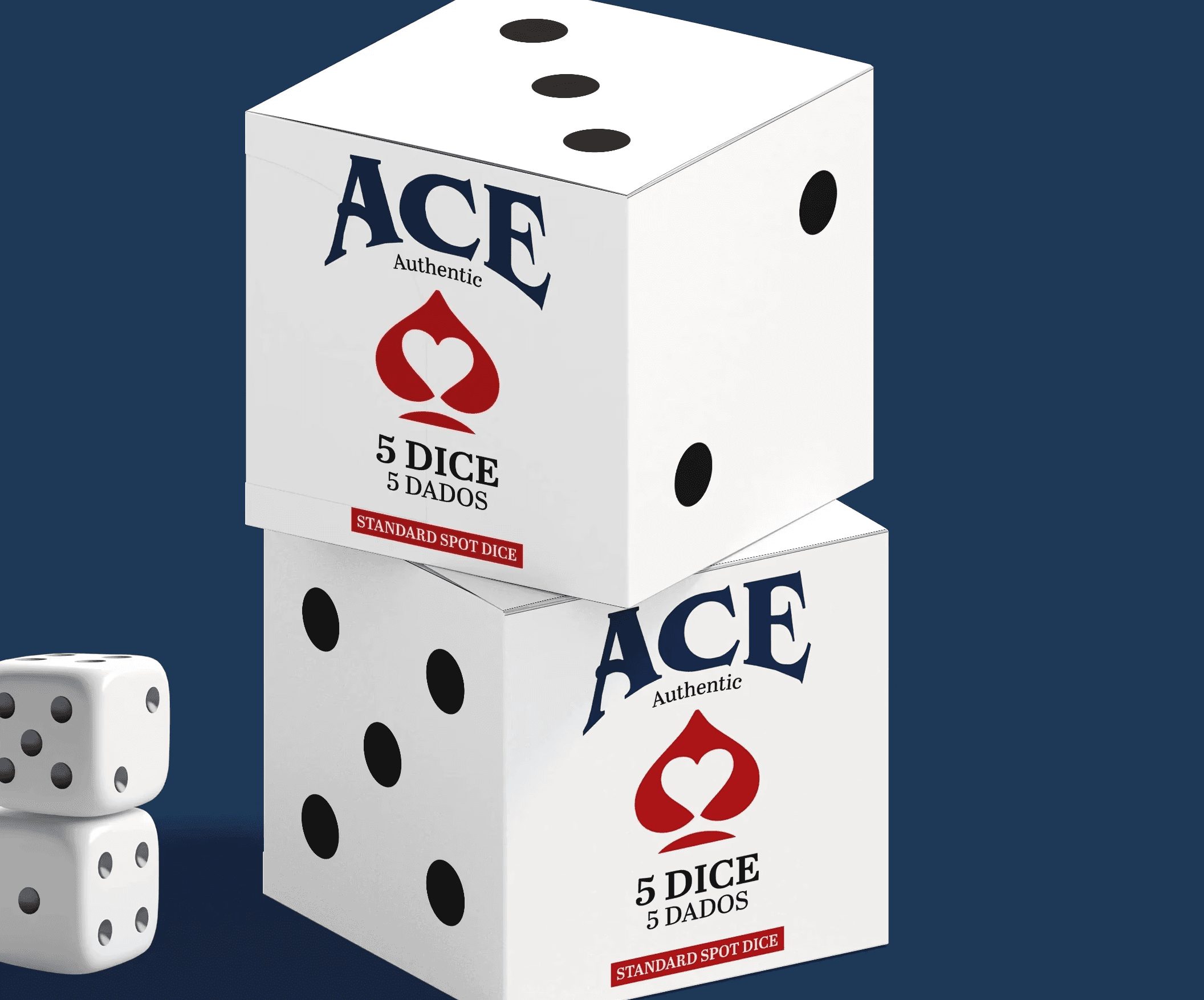
A redesigned package for Ace Dice, made with less material, more functionality, and an overall focus on user experience.
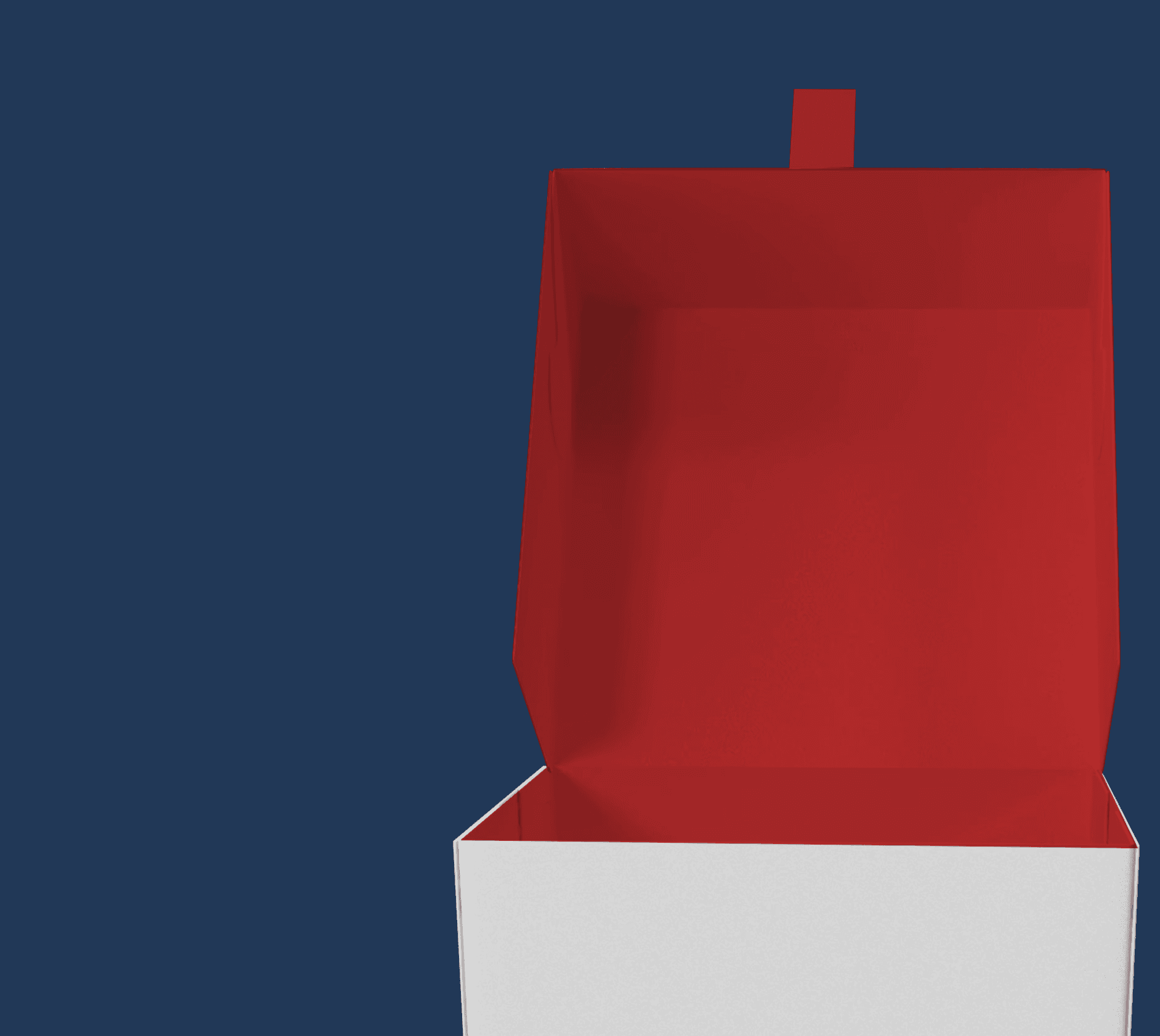
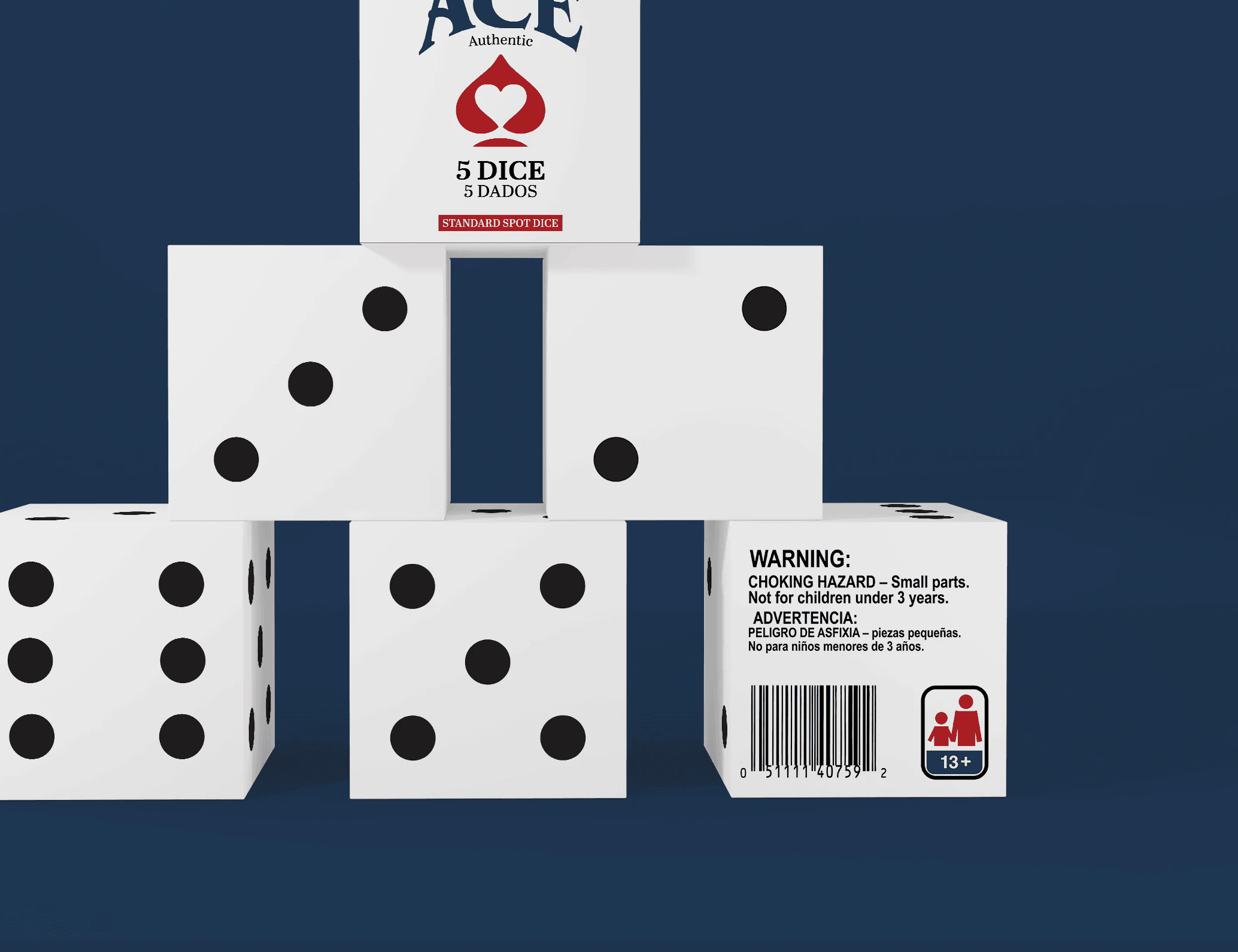
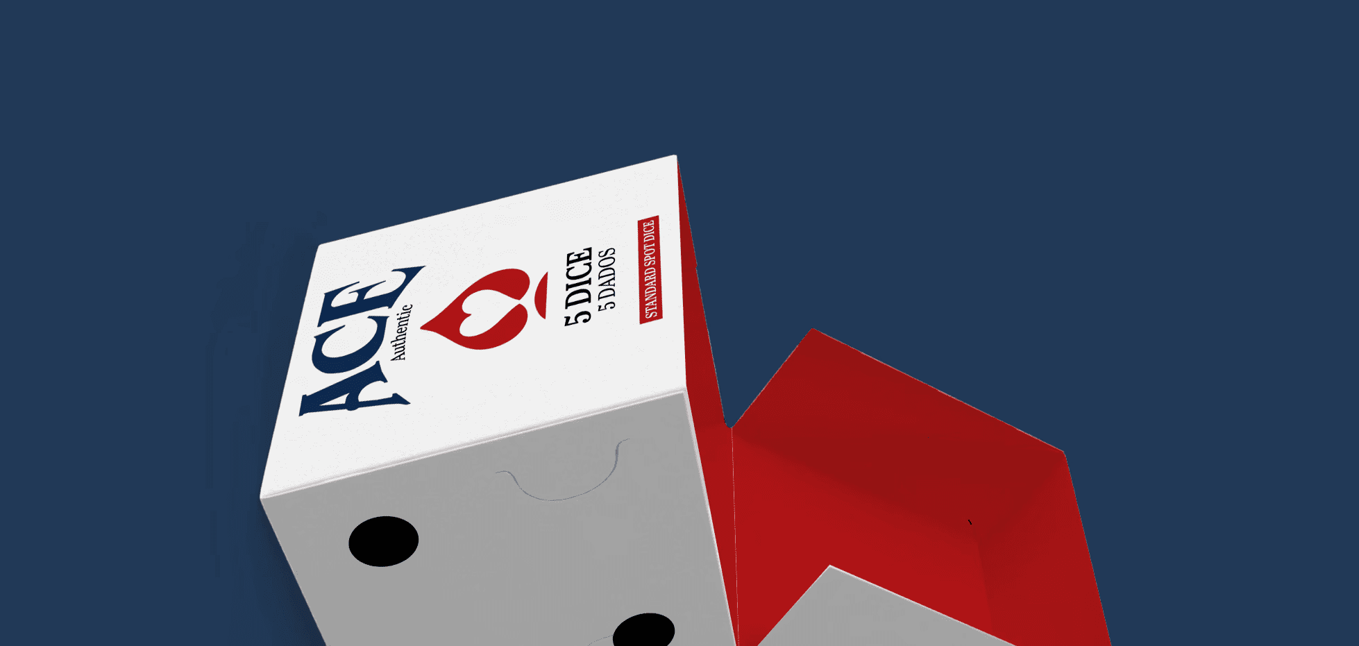
The new package design offers an upgraded, aesthetically pleasing appearance that also improves product accessibility.
Project Type
Package Redesign
Client
Ace Dice
Date
January 2025